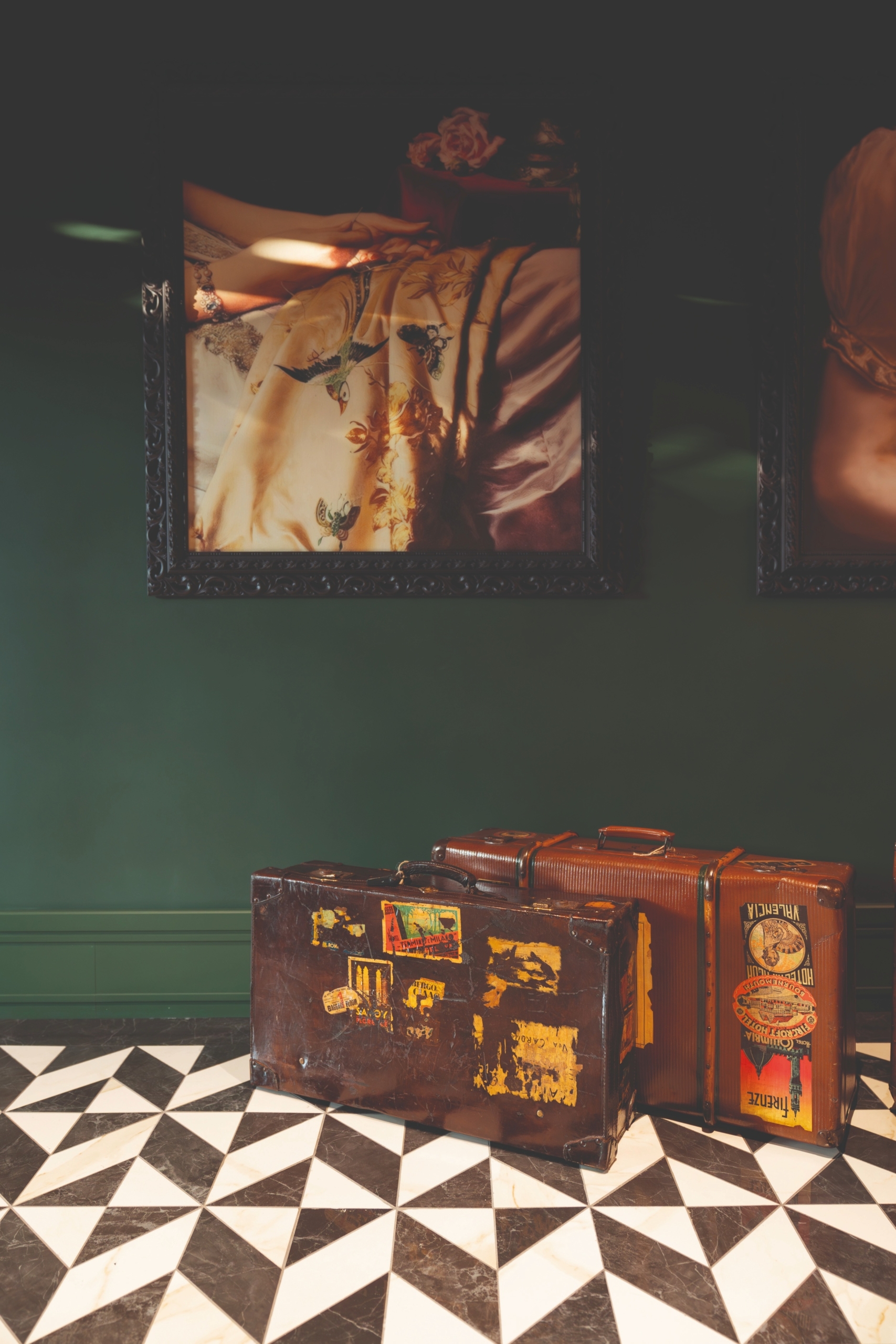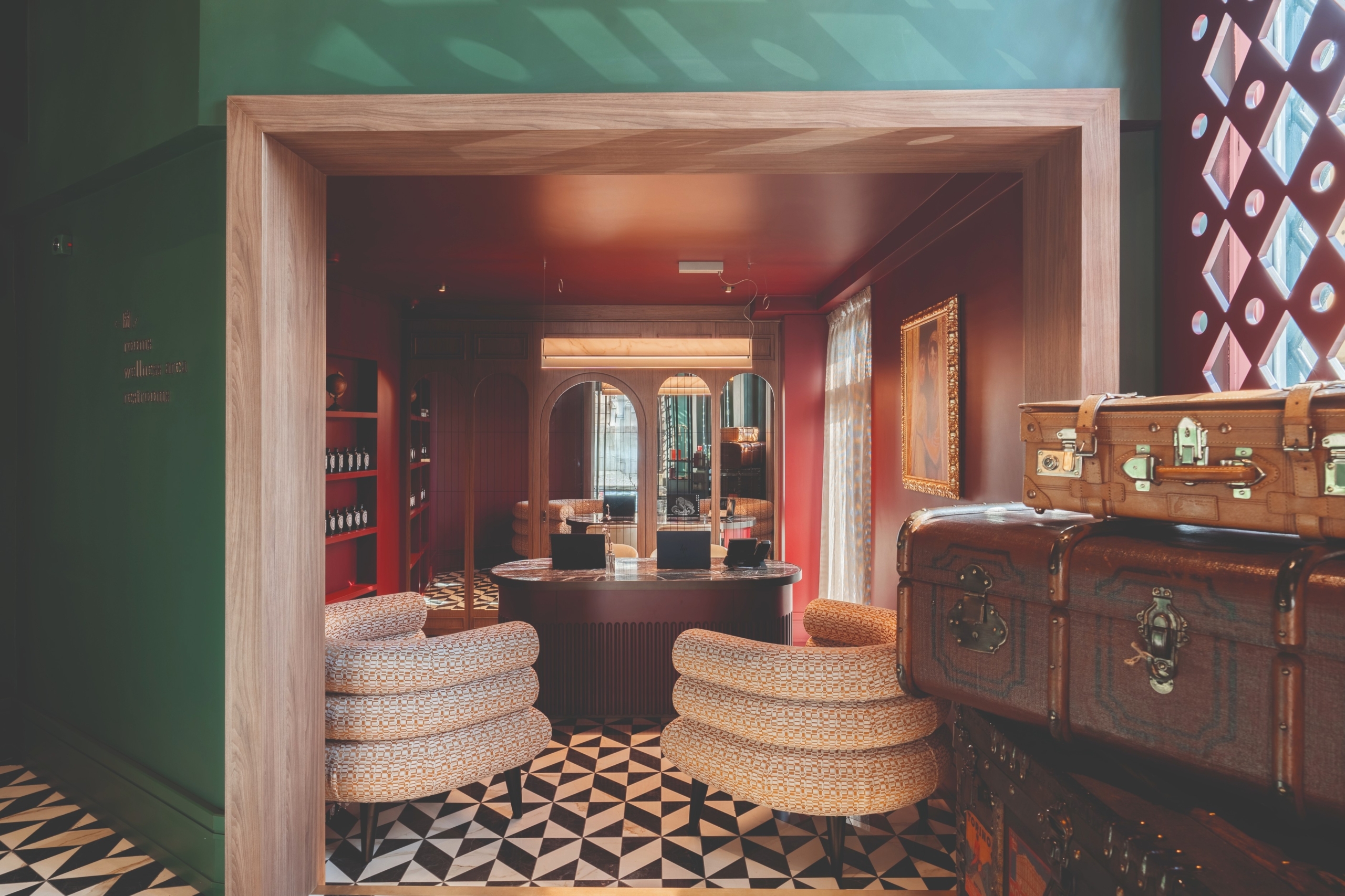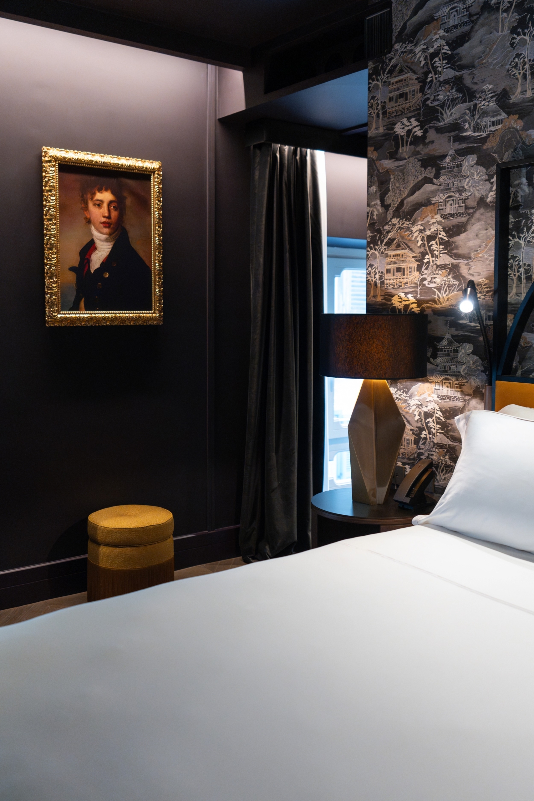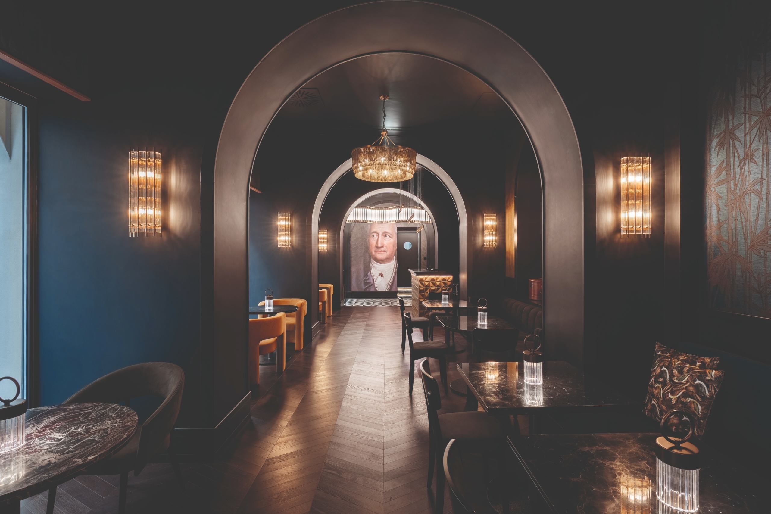
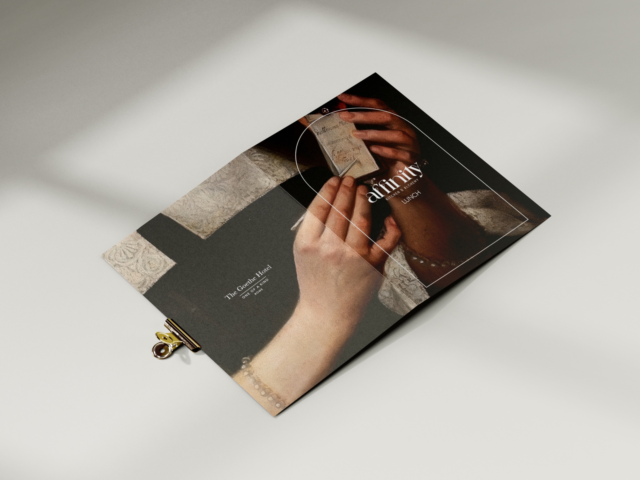
The communication project for The Goethe Hotel is born from the concept of Wanderlust — a German word for the deep desire to travel, that irrepressible urge toward discovery that drove the Romantic intellectuals on their Grand Tour. Wanderlust is the longing to move beyond one's own world in search of something more: it reflects a drive toward personal growth through the exploration of the unknown, encountering unfamiliar cultures and ways of life. This was the starting point for the entire communication project of the hotel.
The Goethe Hotel, inspired by Johann Wolfgang von Goethe's Grand Tour, is conceived as a unique and singular place, created to offer its guests an incomparable travel experience. The hotel is not a destination in itself, but a stop along a journey: an integral part of a route through one of the most beautiful cities in the world.
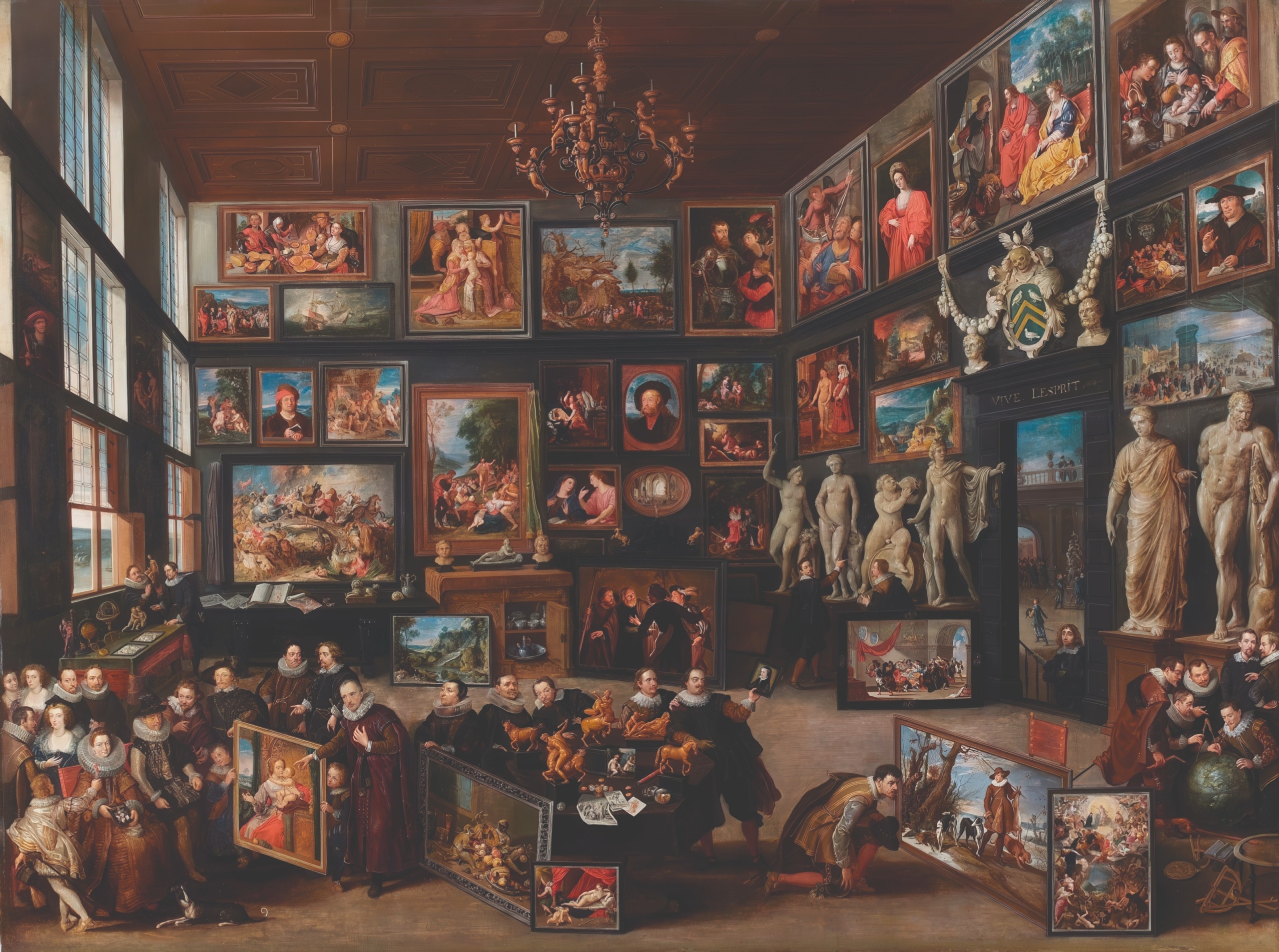
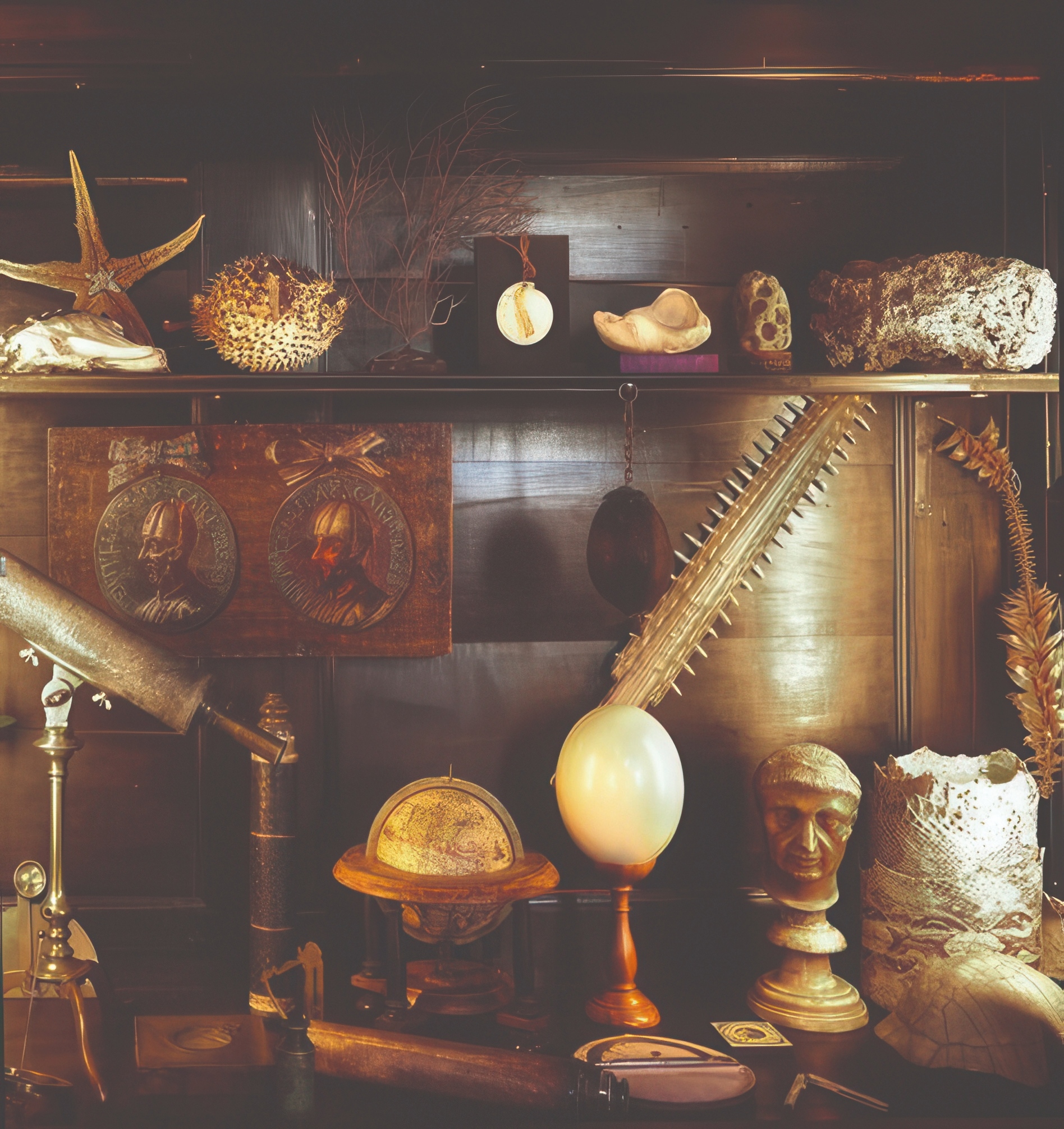
The name of the project: Elective Affinities
Comes from chemical affinity, the property of elements that describes the tendency of some to bond with certain substances rather than others. This is exactly what we want to spark in the guest of The Goethe: an elective affinity between them and their experience of the hotel. We firmly believe that the intensity of an experience lies in its details — the more precise they are, the more rewarding the experience becomes.

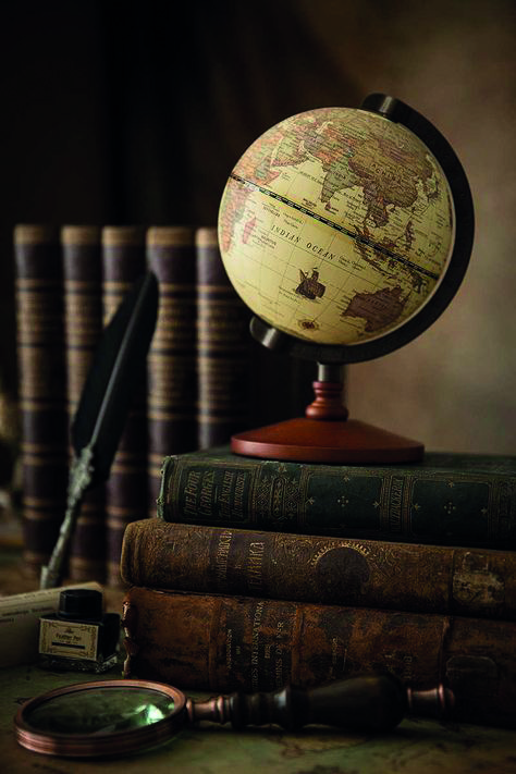
From the Theory of Colours to Goethe's Quill
Even in the approach to the visual identity, it is the writer who points the way. From Goethe's Theory of Colours, light does not arise from colours, the opposite is true; colours are not "primary", but arise from the interaction of light with darkness, comes a palette that entrusts colour with the task of holding and revealing an emotion, helping the viewer hold on to their own memories.

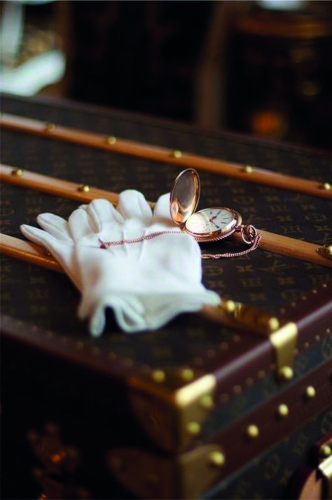
The moodboard builds an imagery suspended between classical statuary and the contemporary gesture, between the Rome of the Grand Tour and today's gaze. Hands brushing against marble busts, details of jewellery and pocket watches, blindfolded sculptures: the images gathered set a sentiment of elegance, memory, sensuality and the desire to discover, in a constant play of mutual attraction between different eras.
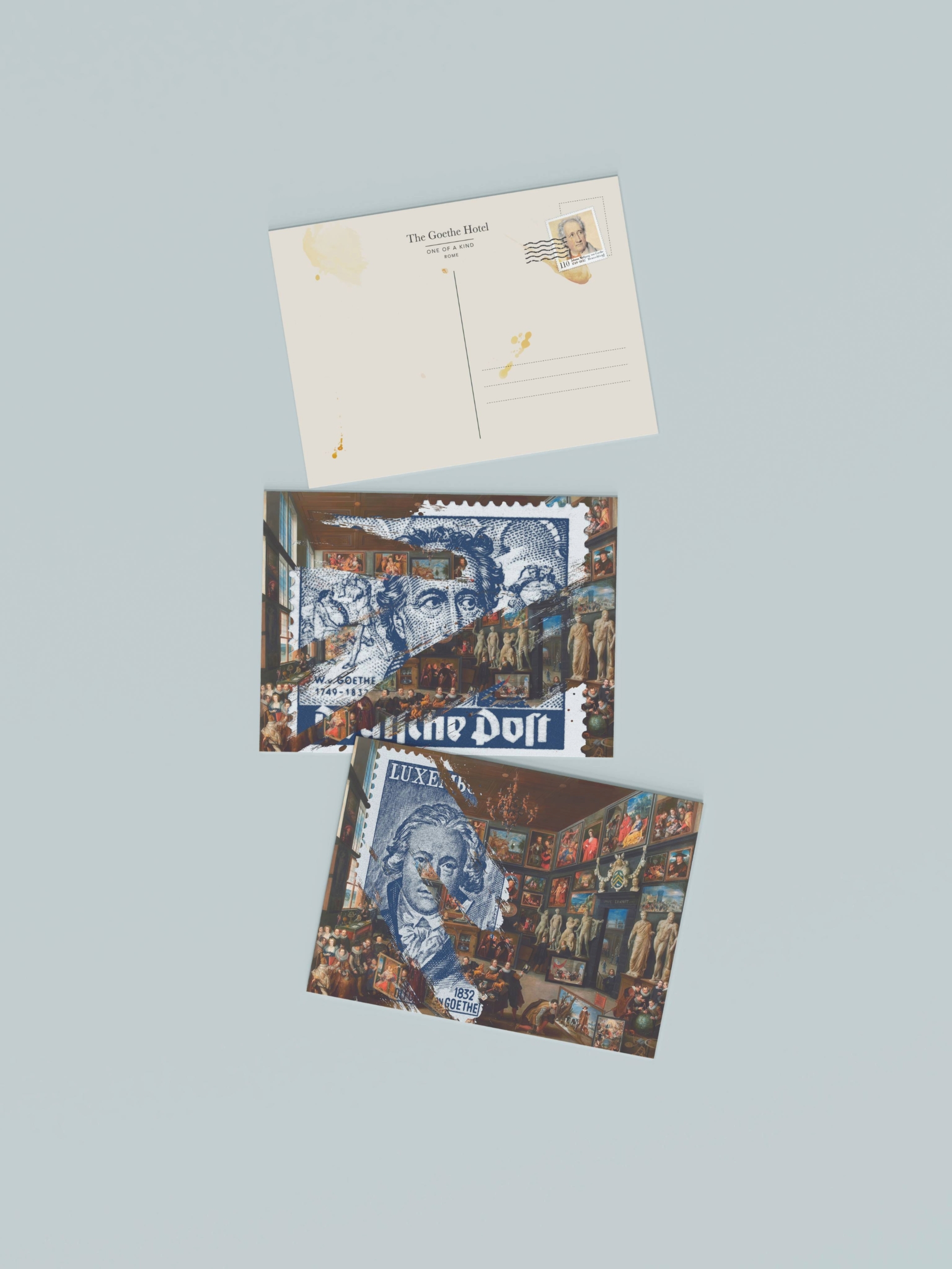
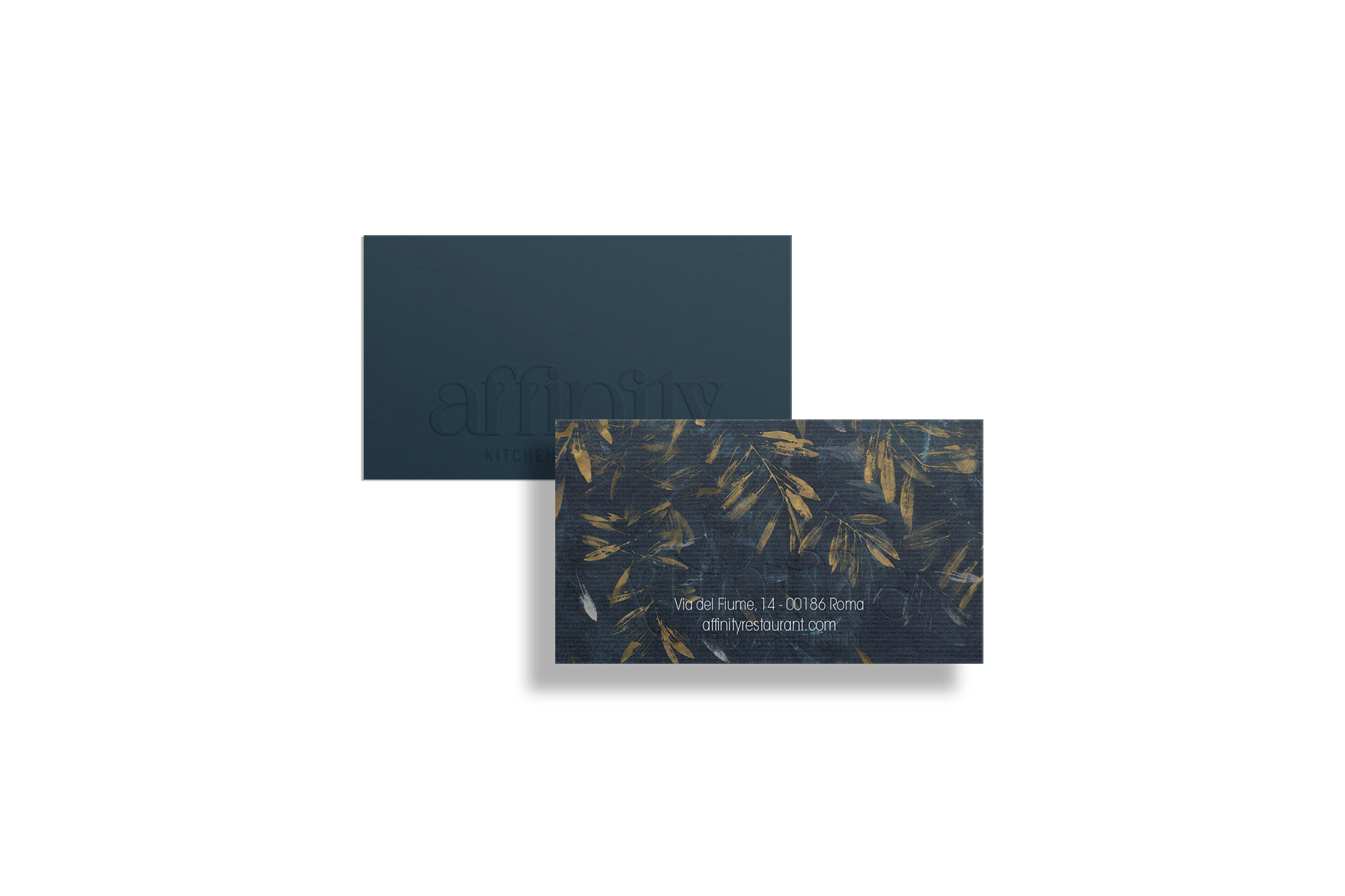
Gold, for Goethe a light dimmed by darkness, is in colour psychology associated with wealth, success and knowledge: a colour that speaks of trust, prestige and status. Blue, darkness touched by light, instead represents calm, depth, loyalty and balance, but also spirituality and mystery.
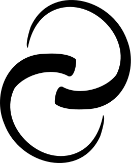
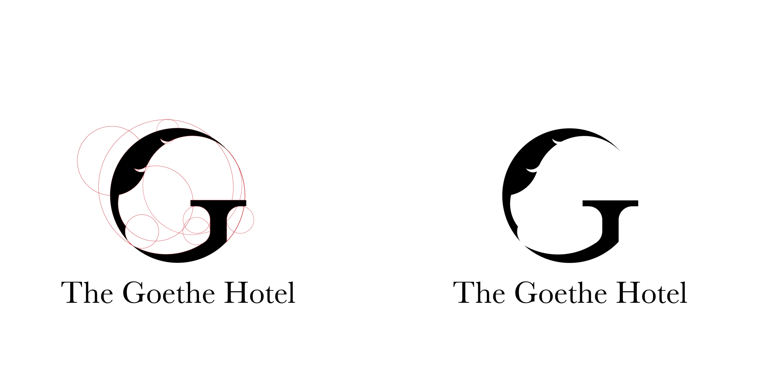
The logo is born from the fusion of the "G" of Goethe and the quill, the instrument writers once used to bring their works to life. Its construction is based on the circles of the golden ratio, which give the mark maximum harmony and legibility in its lines. The choice of typeface also follows two complementary paths, both driven by the will for a strong mark that is distinctive, recognisable and flexible: Baskerville, a serif typeface from 1757 created by calligrapher John Baskerville, today considered among the ten best typefaces in history for legibility and elegance — chosen to represent the bridge between past and present; Avenir, a sans serif designed by Adrian Frutiger, built on geometric forms with a humanist touch that makes it versatile for both body text and headings. The goal is not to tie the brand to a trend, but to build an iconography that conveys recognisability, contemporaneity and timeless elegance.
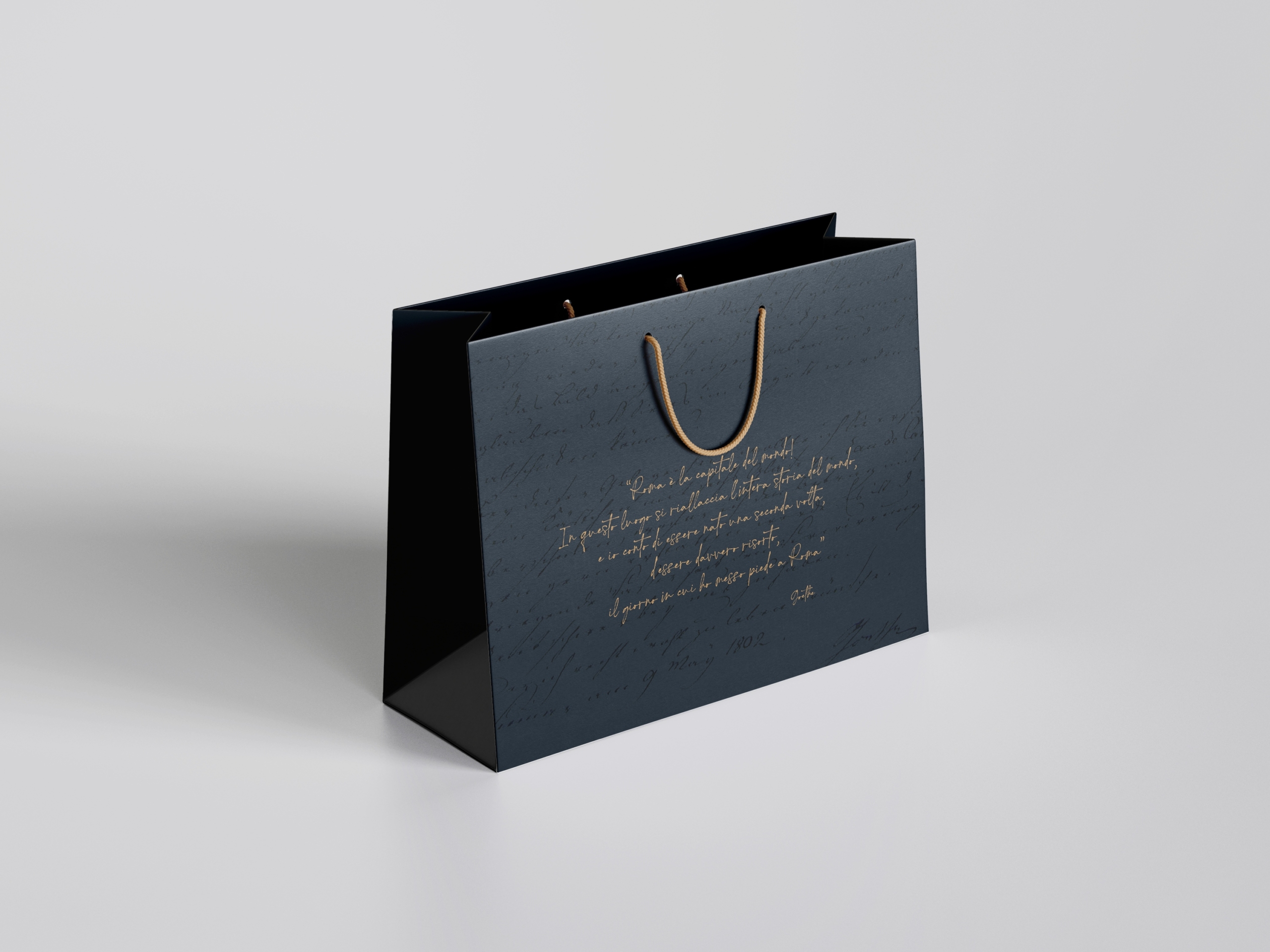

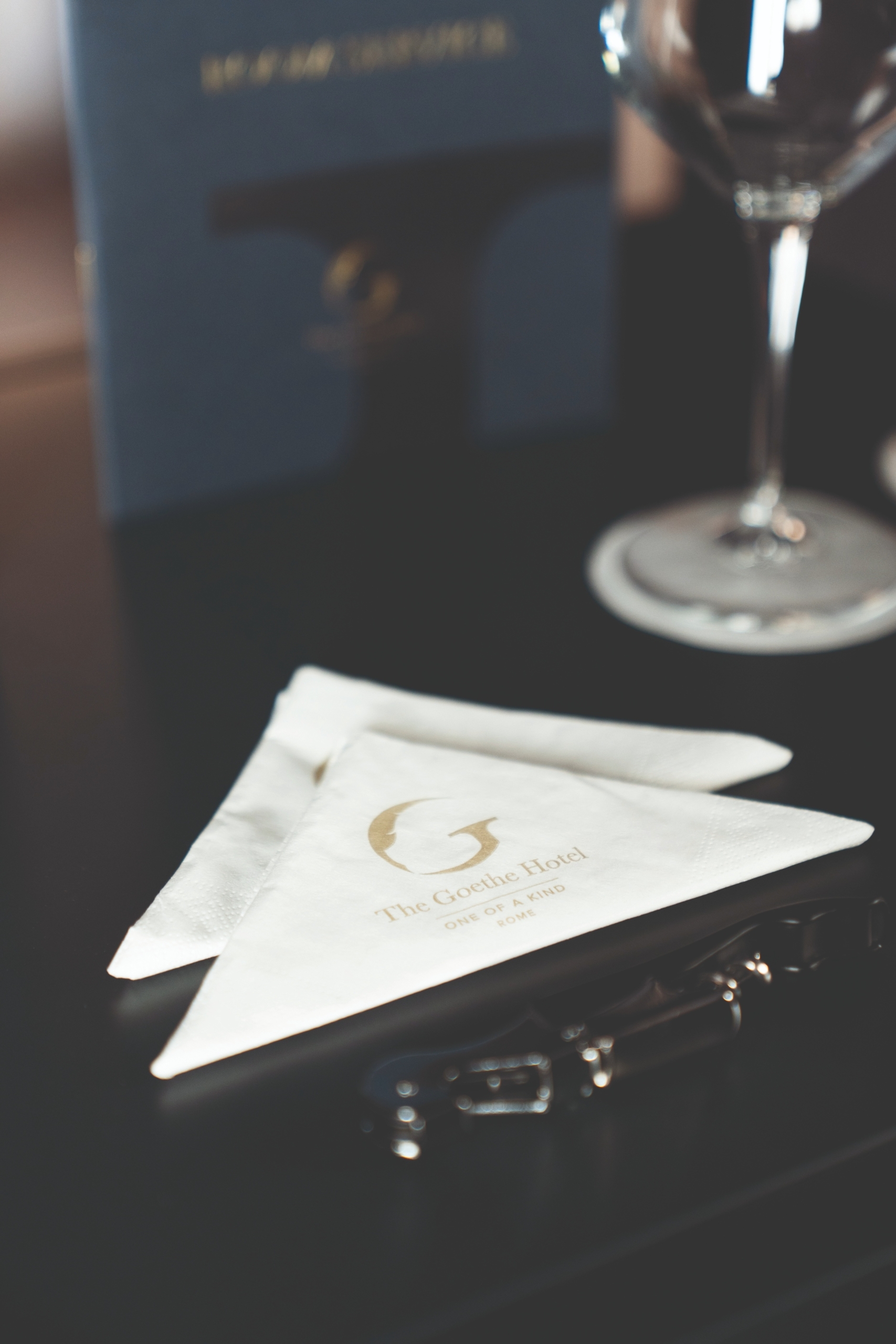
The mark comes to life across its many applications, designed to adapt to every context and format: from the full combination of symbol, name, payoff "One of a Kind" and location for large formats, down to the symbol alone for the hotel's internal materials and products, never smaller than 2 centimetres.
The same language runs through the collaterals designed to accompany the guest's stay: the key card, business cards in both blue and gold variants, letterhead, the laundry bag, the luggage tag to attach to bags, and the checkout wallet that bids the guest farewell with a handwritten "Thank you!". Wax seals, calligraphic details and carefully chosen quotes accompany every touchpoint, keeping alive the play between past and present that runs through the whole project.
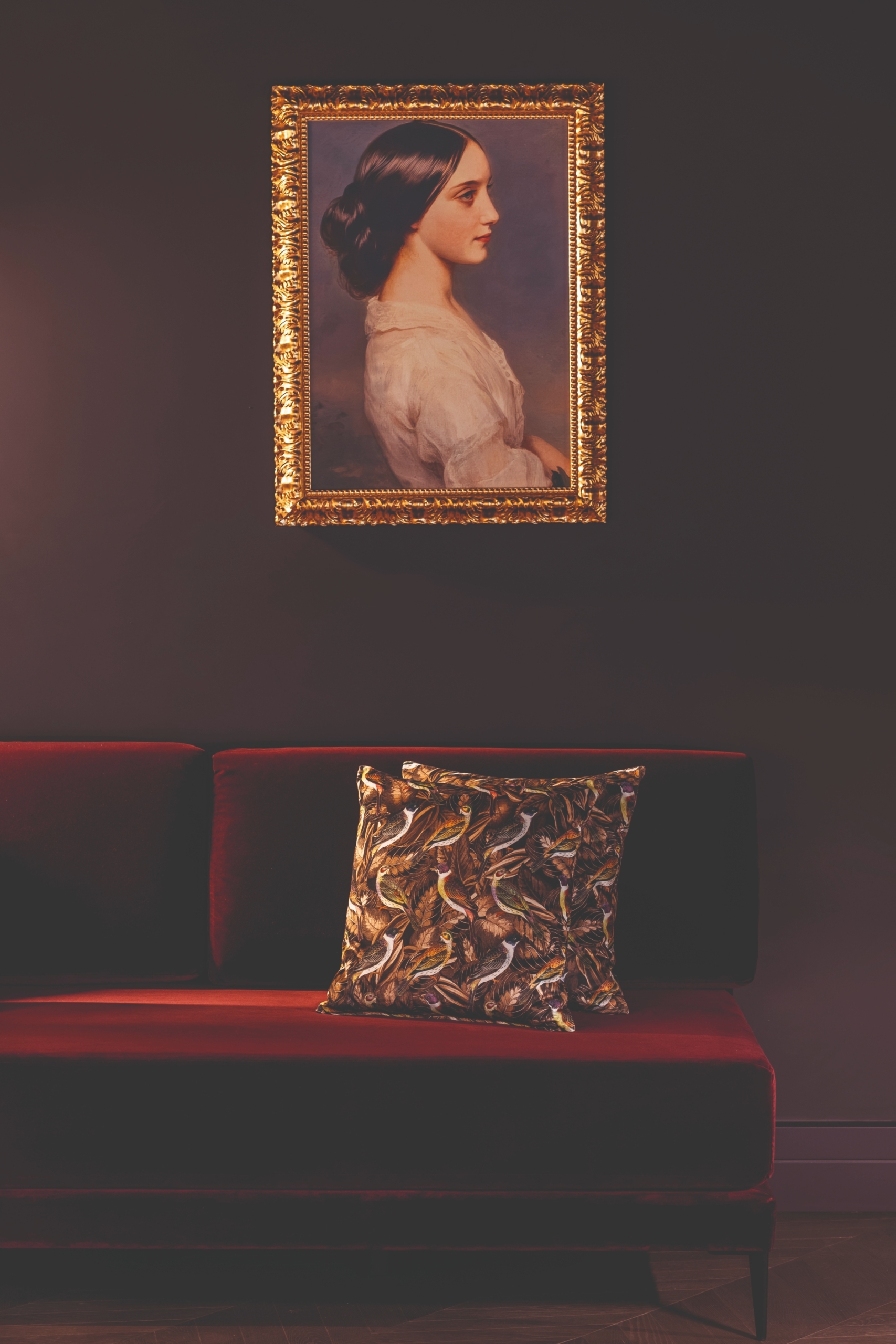
The mark comes full circle within the real spaces of The Goethe Hotel, where the eclecticism of the interior design meets the simplicity of the graphic sign. The logo appears in its different colour variants — white on dark backgrounds such as the burgundy of the lobby, gold against deep green tones, blue on lighter marble — engaging each time in dialogue with the space that holds it: past and present, once again, at play with one another.