Puccini
Culture, inclusivity and joy are the drivers that guided the concept behind il Puccini, a hotel born at the centre of a unique and heterogeneous context, where art and culture, past and present, mix continuously. The hotel takes its name and location from the Elfo Puccini Theatre, which faces onto the same gallery as the entrance, along Corso Buenos Aires, one of the longest shopping streets in Europe and the beating heart of the Porta Venezia district.
The theatre, founded in 1902 as a venue for popular entertainment and renamed Teatro Puccini in 1930 in tribute to the composer, has gone through decades of transformation, from cinema to variety shows, from prose to contemporary theatre, always remaining true to its mission: to welcome, entertain and amuse. It is a spirit that the hotel project picks up and carries forward, in a neighbourhood that Time Out named one of the forty coolest areas on the planet, a crossroads of inclusivity, experimentation and street life.
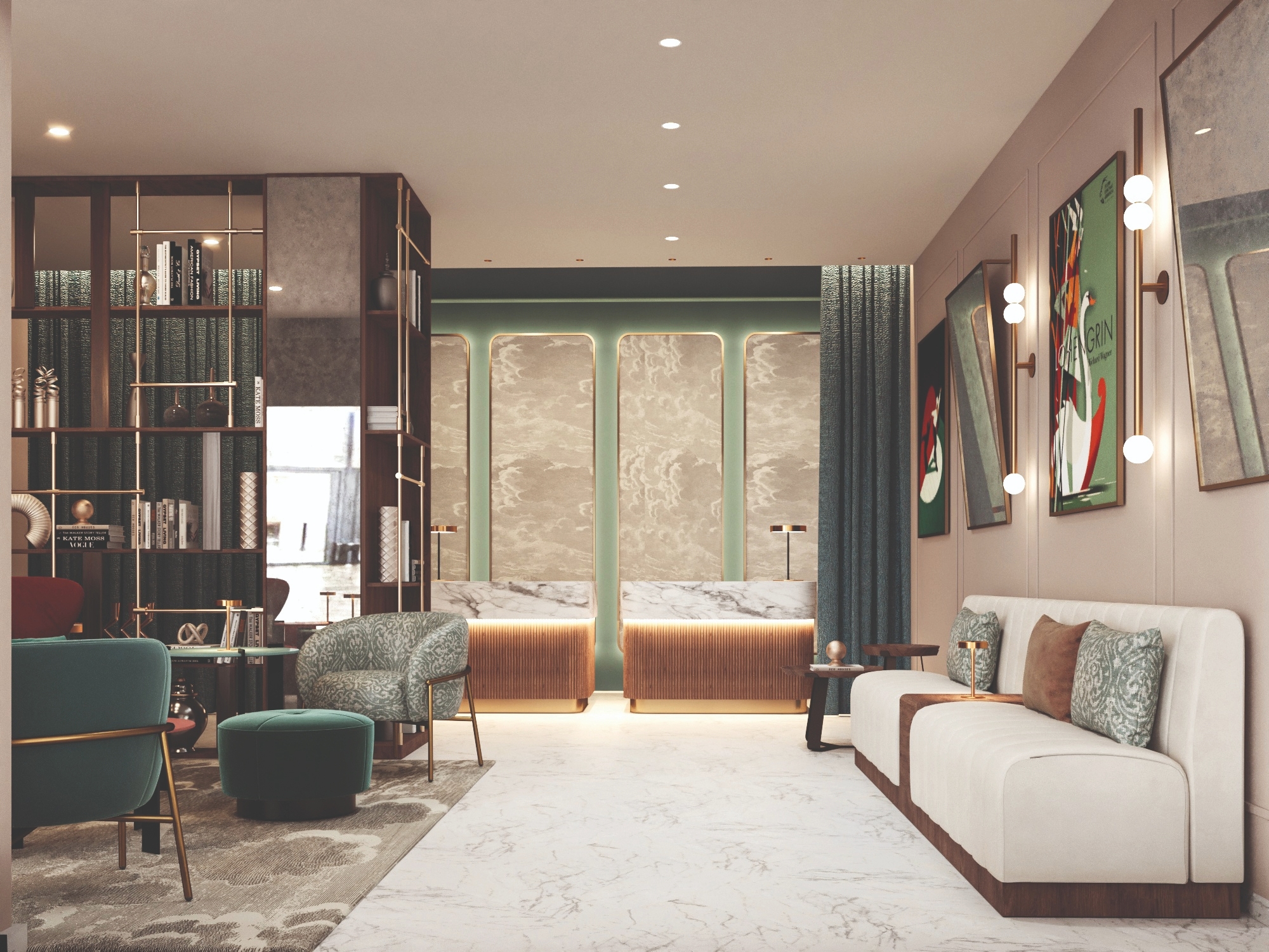
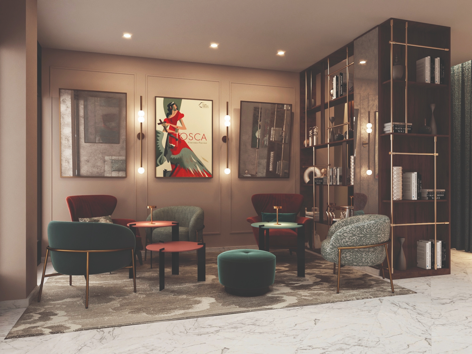
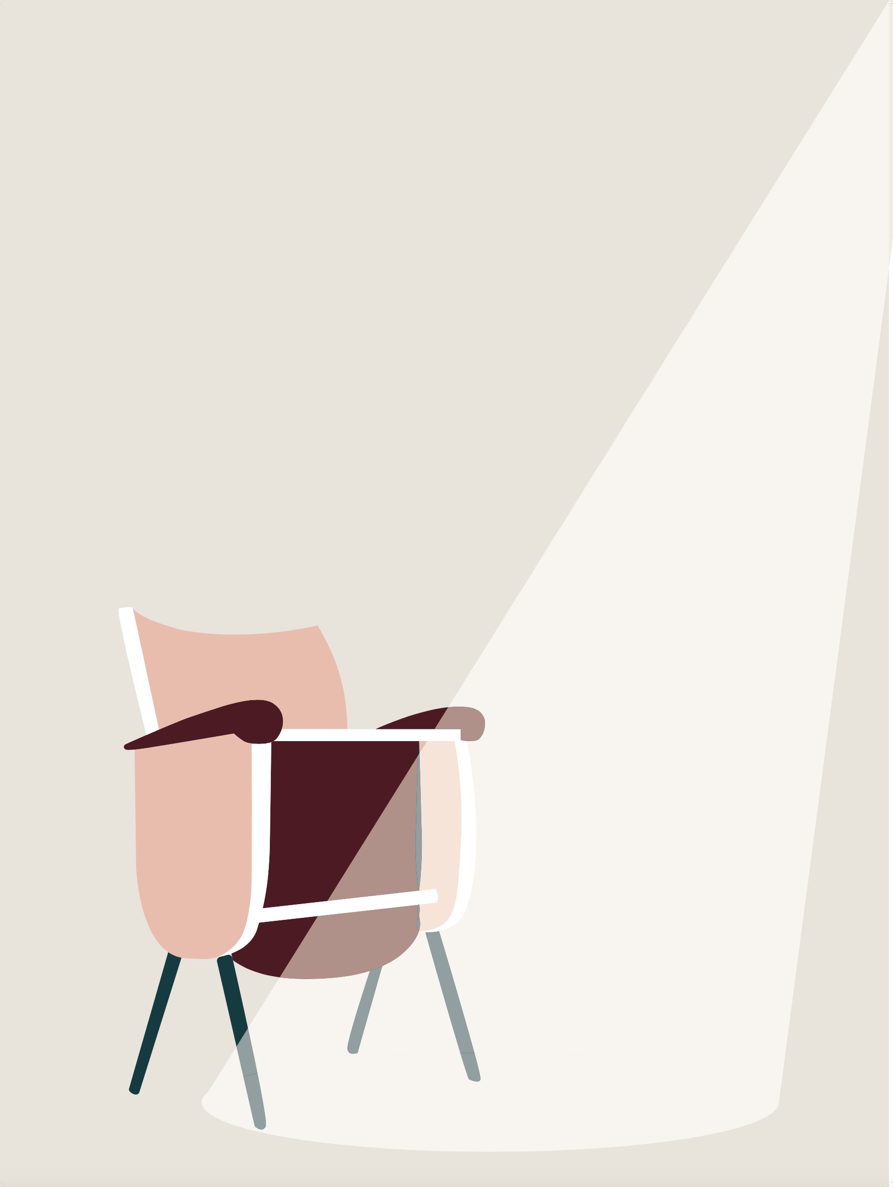
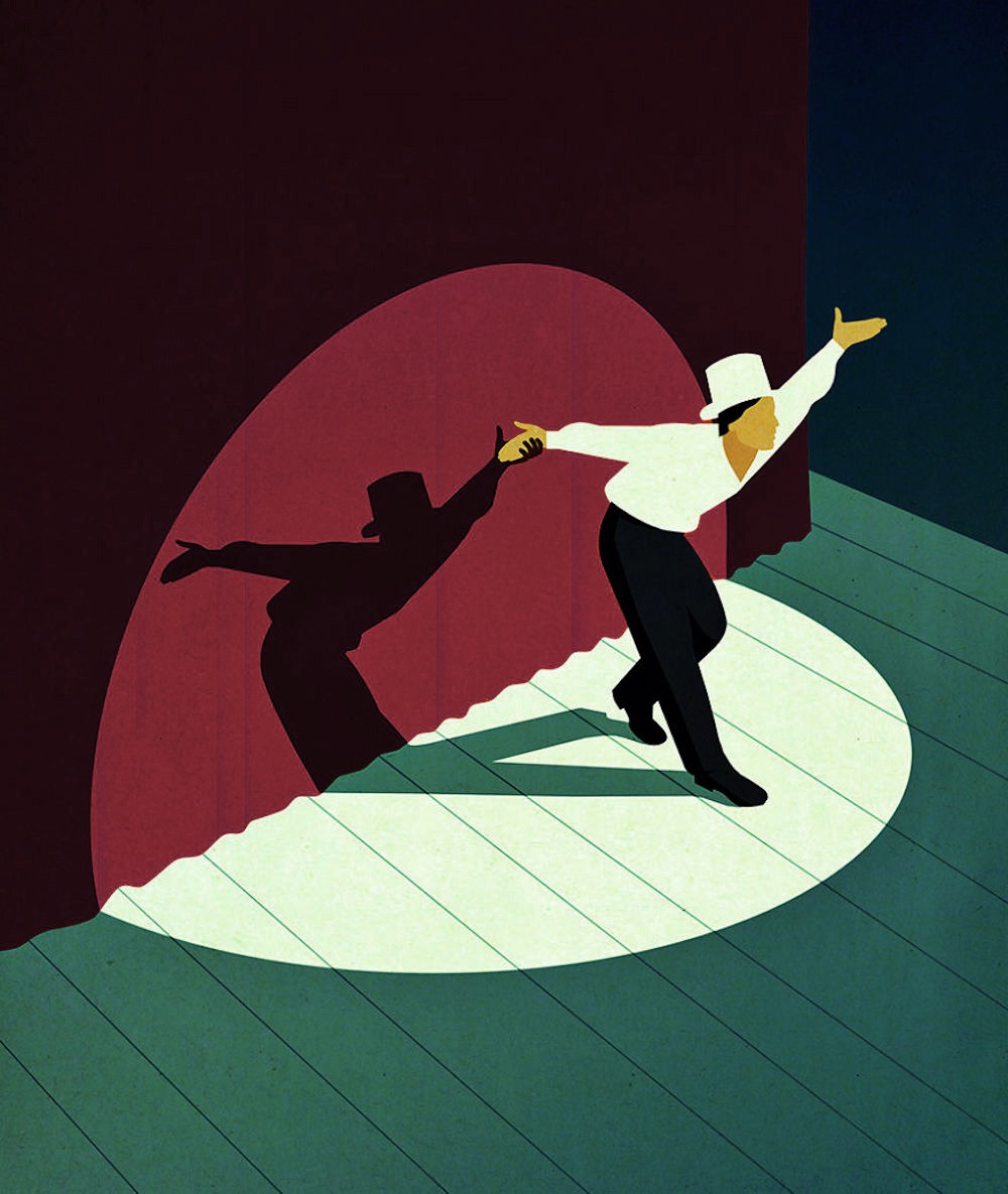
Past and present coexist in the hotel's design, which reinterprets theatrical references throughout the space: the scenographic backdrops at reception, the curtains dividing the F&B areas, the details that recall backstage life. Without ever being too literal, il Puccini invites guests to live their stay as the protagonist of their own scene, "your hotel, your stage."
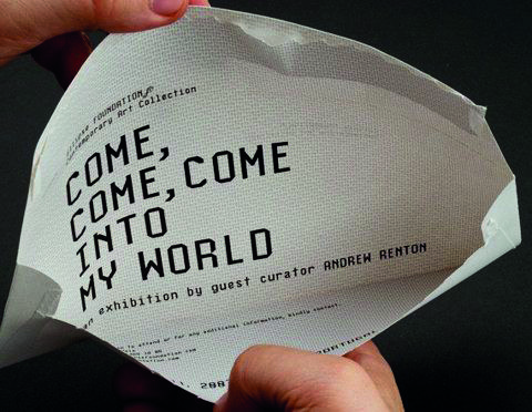
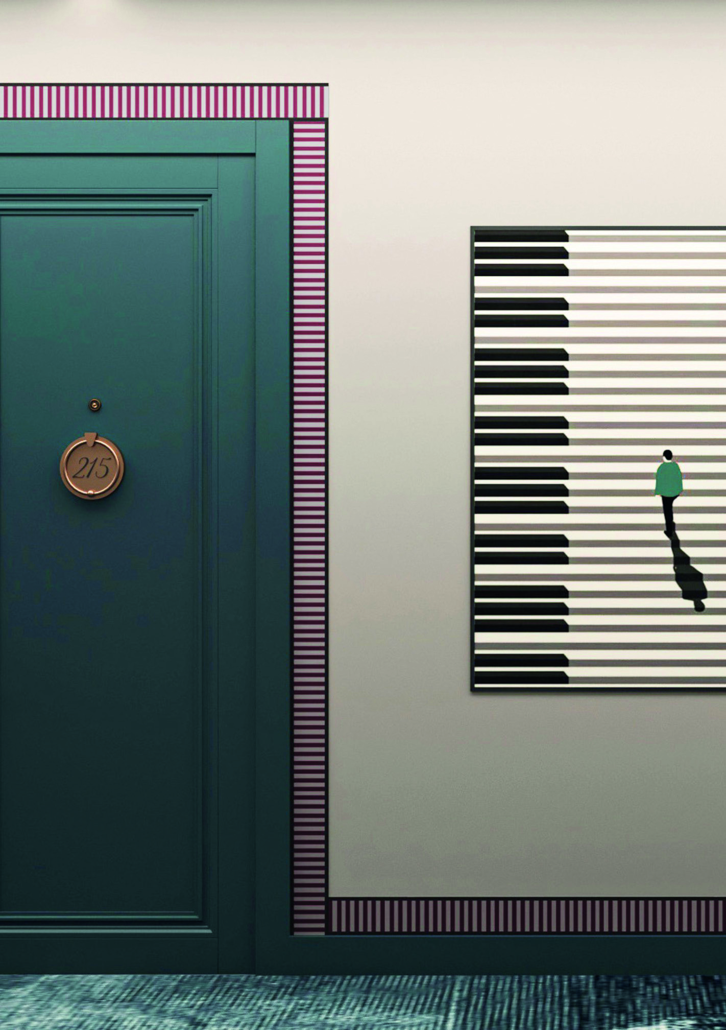
"My hotel is the venue at the source of my inspiration, my refuge."
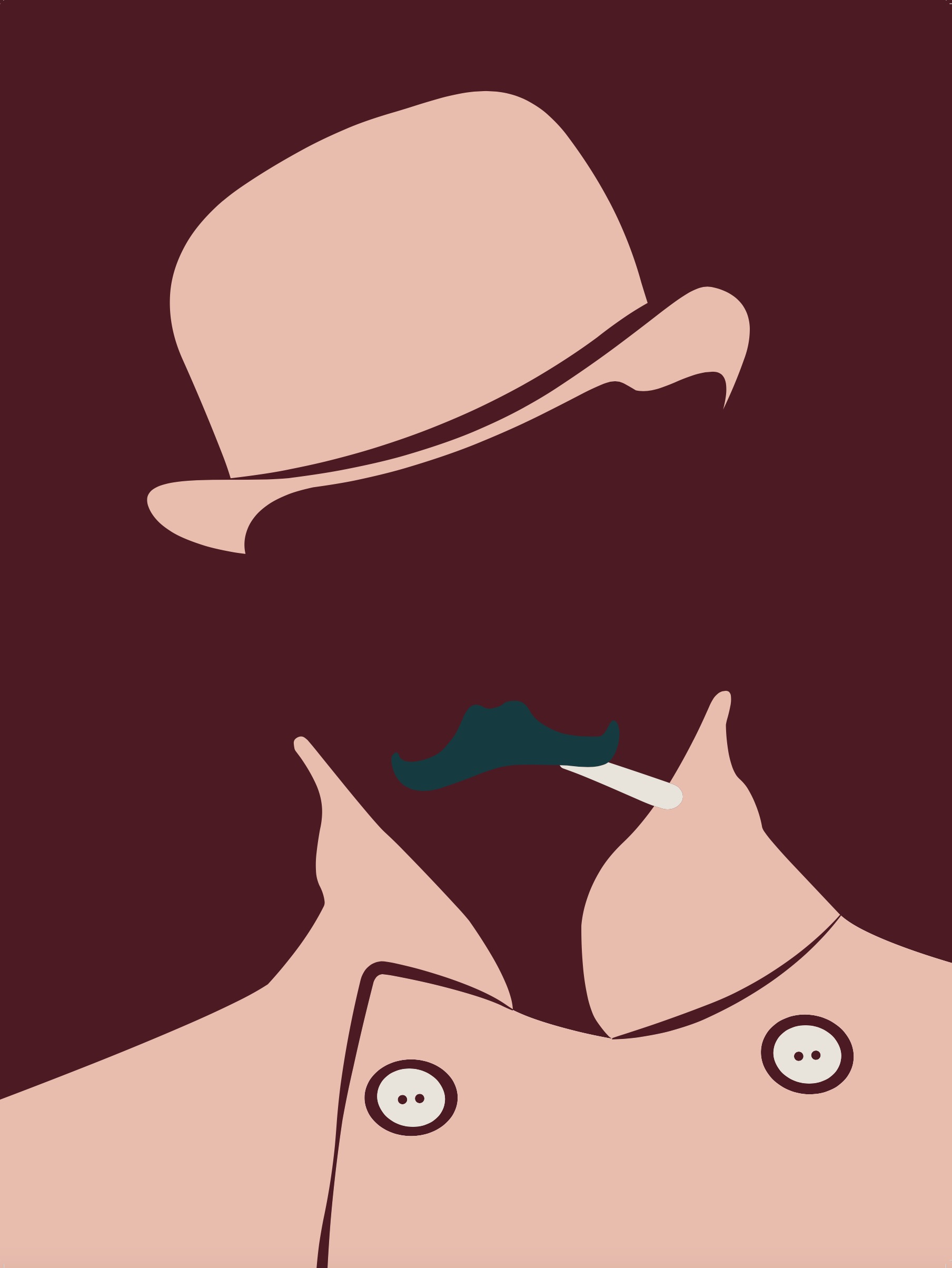
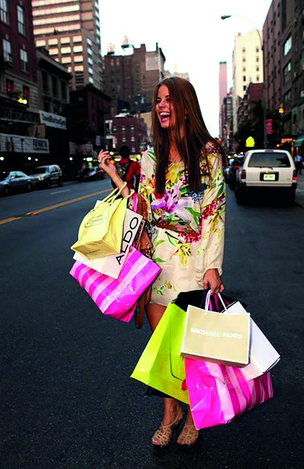
The moodboard builds the imagery of a contemporary flâneur: an eclectic, curious soul who throws themselves fearlessly into the chaos of urban life, drawing nourishment from the countless nuances only a city can offer, between art, chance encounters and the beauty hidden in every corner.
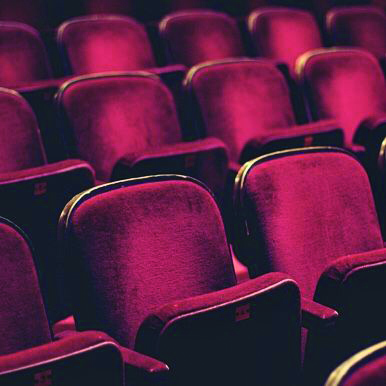
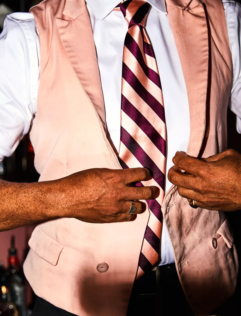
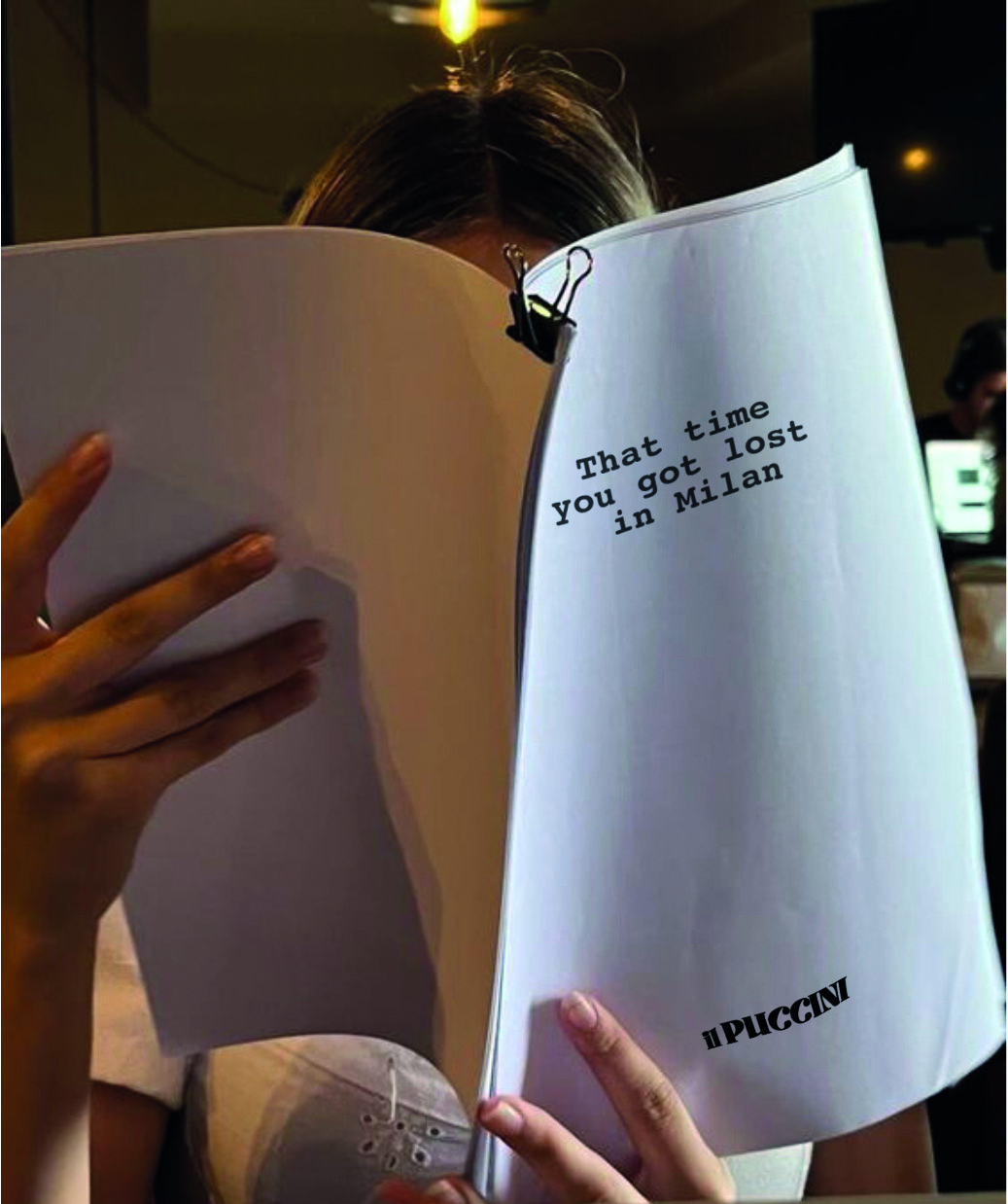
From here comes a palette that plays with classic theatre colours, given a strong hint of modernity and boldness, capable of creating instantly recognisable visual contrasts: stage curtains, colourful stripes, high colour contrast, eye catching quotes. The result is an imagery that echoes 1920s posters and theatre billboards, in constant balance between pop energy and stage sophistication.
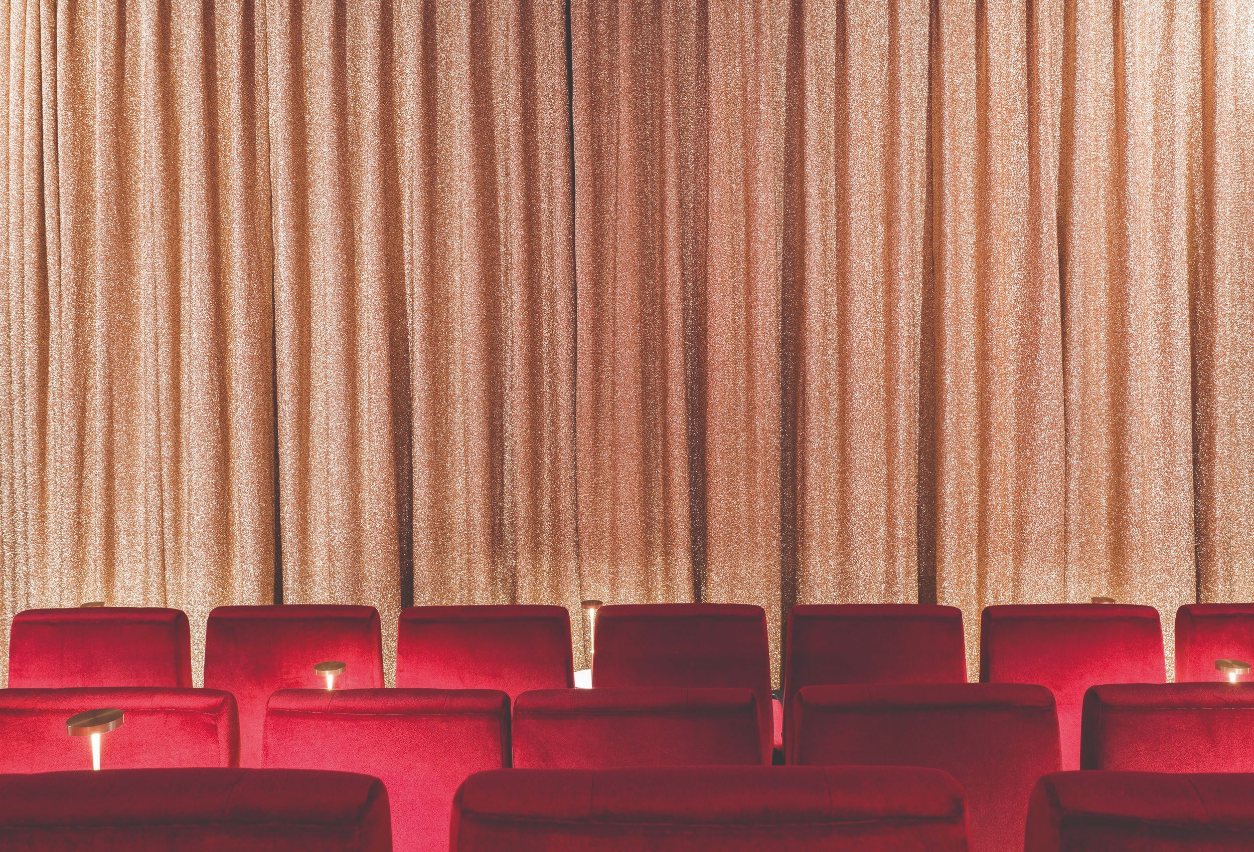

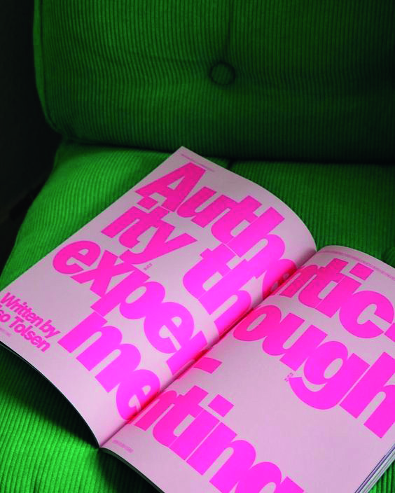
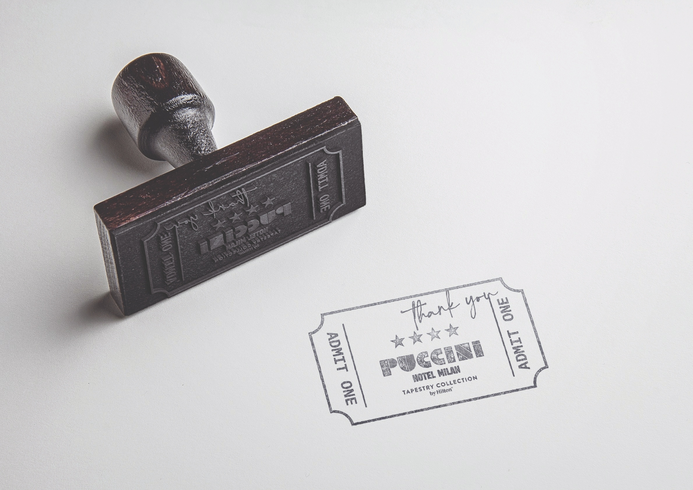
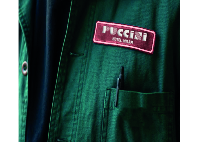
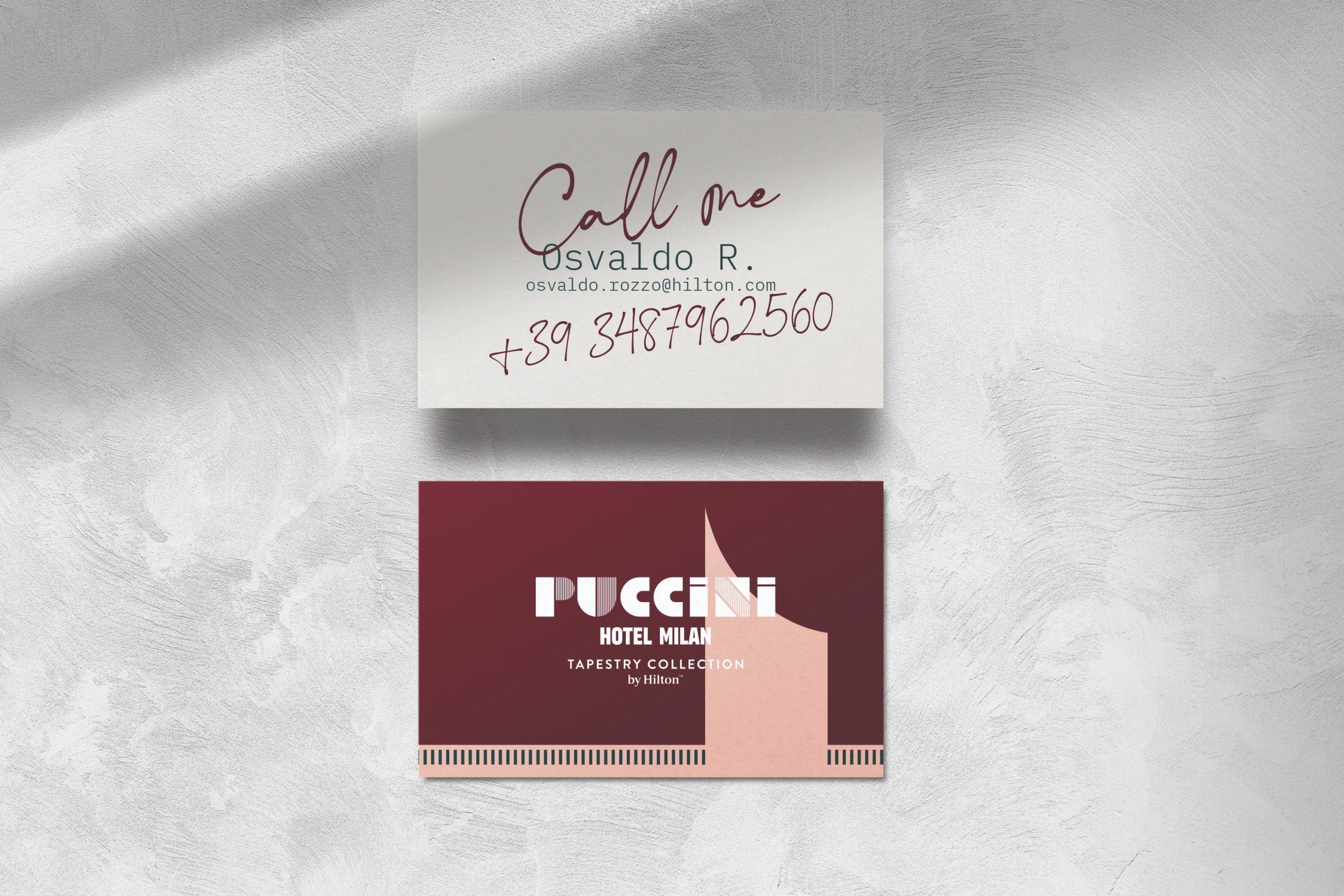
The logotype is born from the desire for a graphic language with personality and impact. The reference is to early twentieth century graphics, posters and theatre billboards, but also to the design of the hotel itself: the mark's stripes echo the corridor door frame decorations and the fringes of the stage curtains.
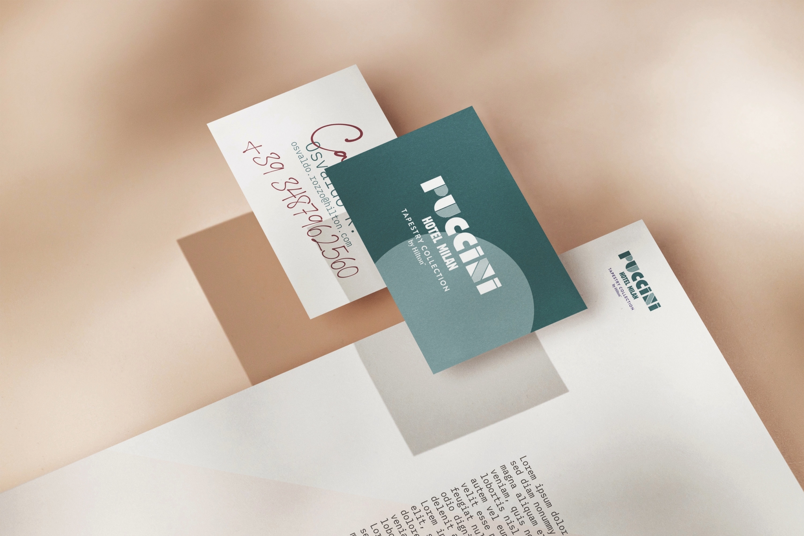
The name clearly echoes the past, but the typeface chosen is deliberately contemporary, with a nod to turn of the century billboard graphics: past and present coexist in a simple yet effective graphic form. The palette plays with bold, joyful tones, an intense terracotta red, a dusty pink, a deep petrol green, designed to create visual contrast across every communication touchpoint.

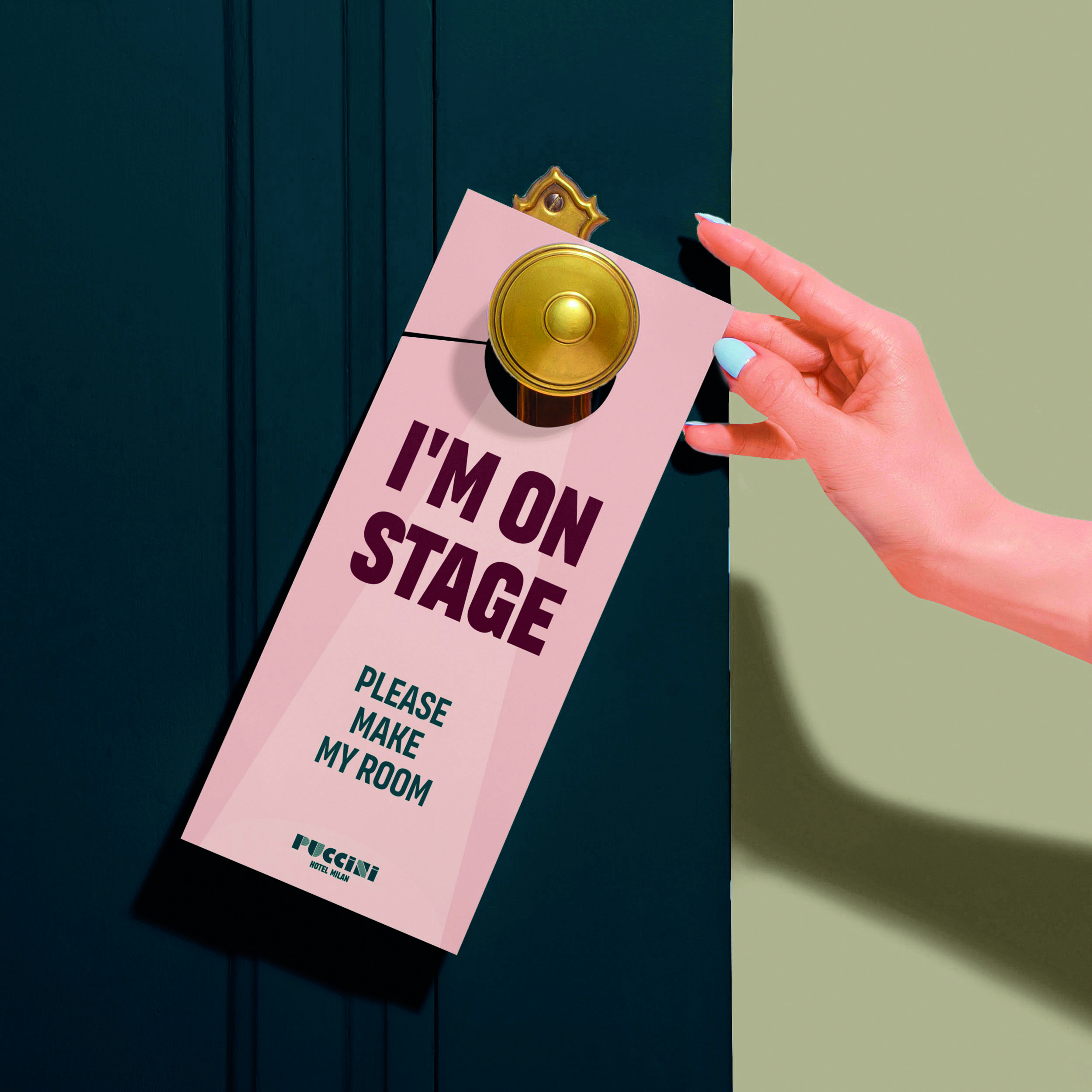
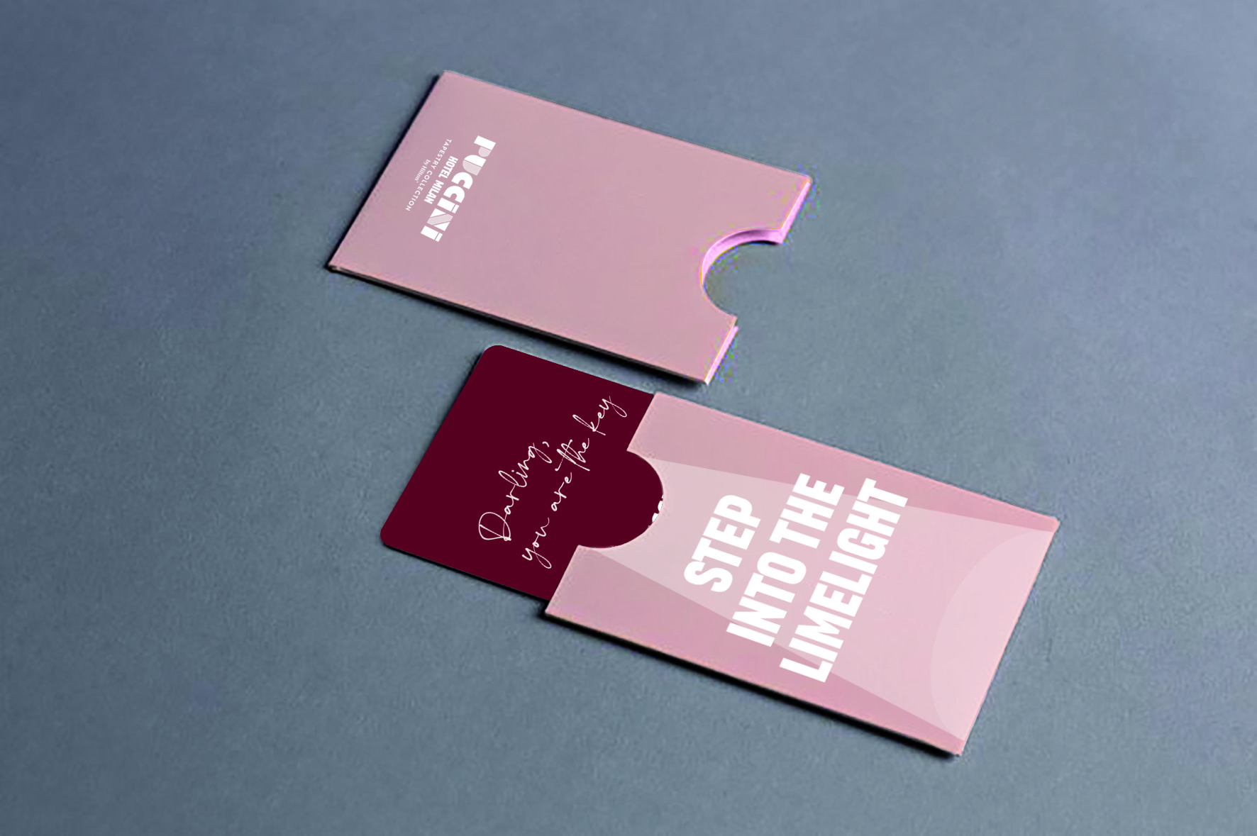
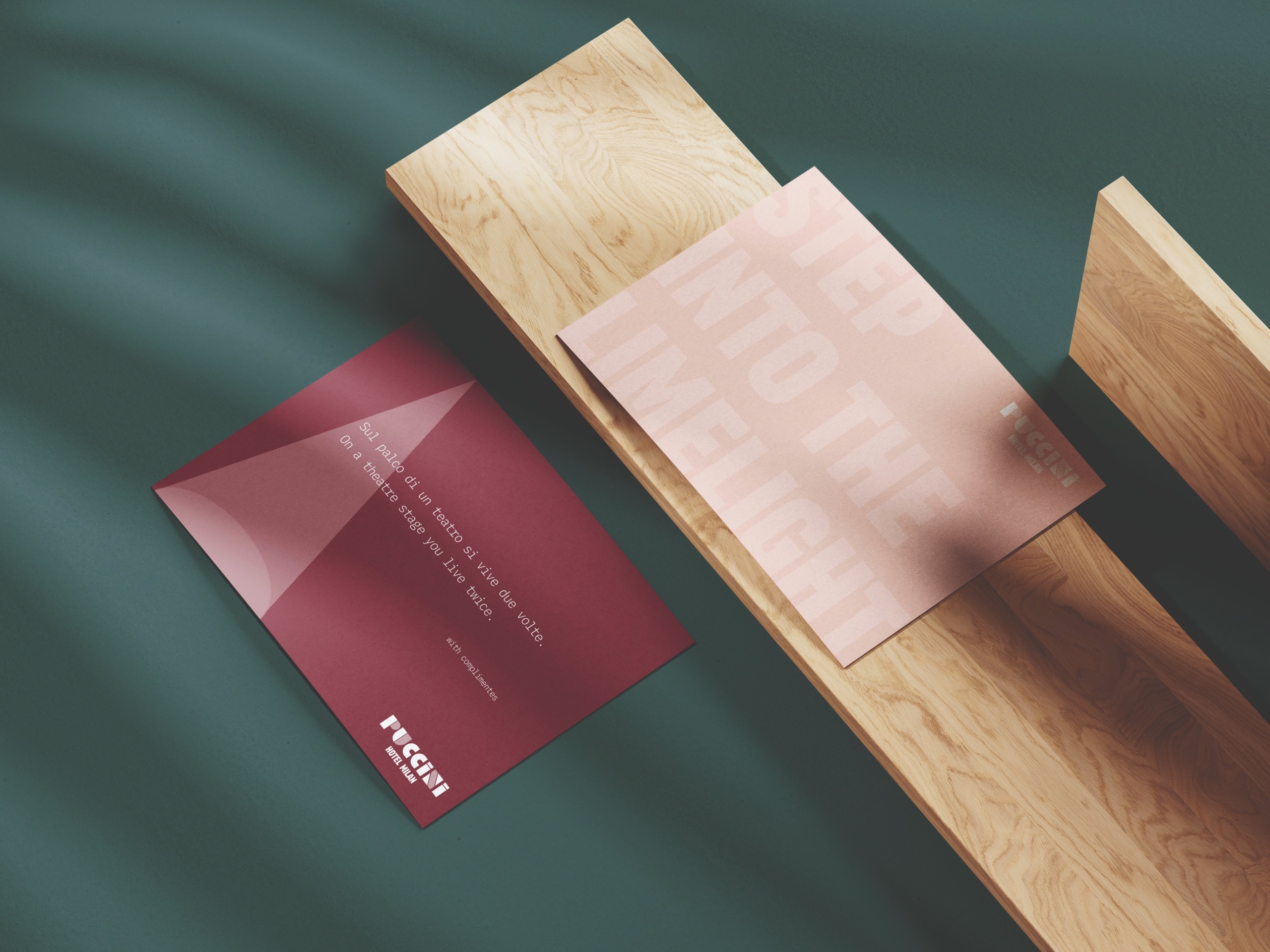
The graphic language takes shape across two complementary variants, "Into the Limelight" and "Theatre Curtain," applied to business cards, luggage tags and key cards, where the card itself becomes a metaphor for the curtain rising under the spotlight. In the corridors, artworks and scenographic details accompany guests to their room, while the "Do Not Disturb" sign plays with theatrical language, becoming "Live stage performance: do not disturb."
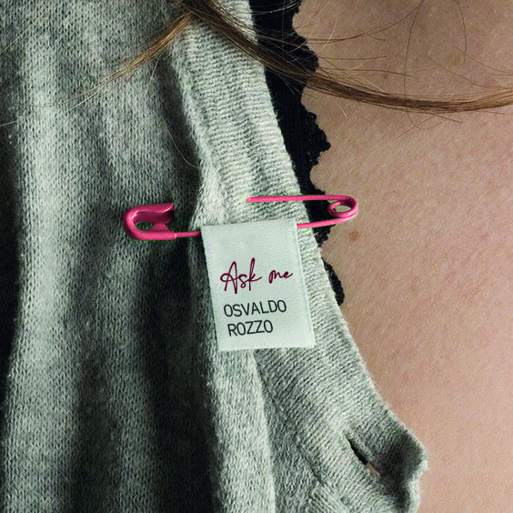
In the rooms, the collaterals carry the narrative forward: laundry paper bags, personalised courtesy notes, a room service menu designed like a show's programme. Even check in becomes part of the scene, with guests asked for an autograph in place of a simple signature.
The story takes shape in the hotel's real spaces:
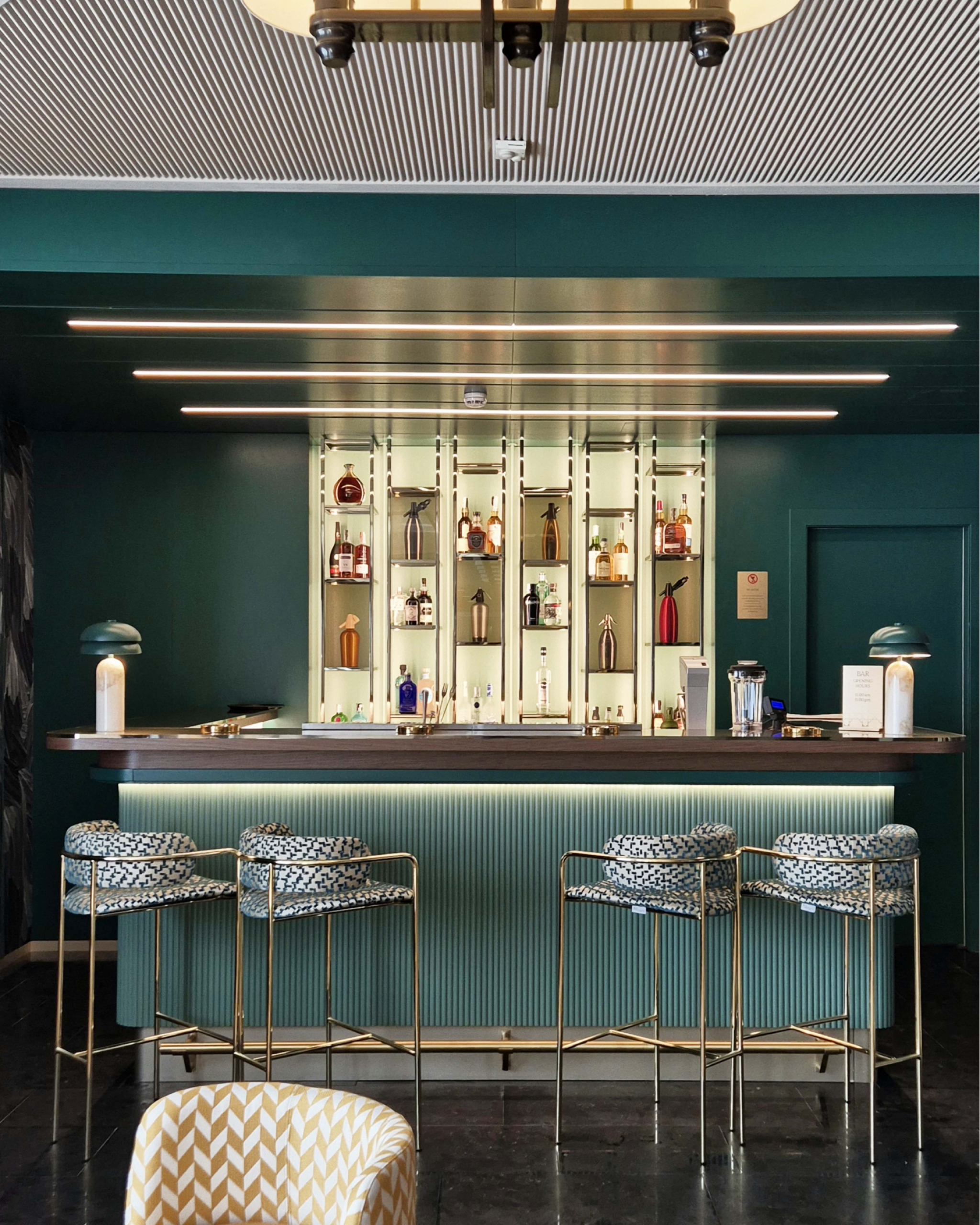
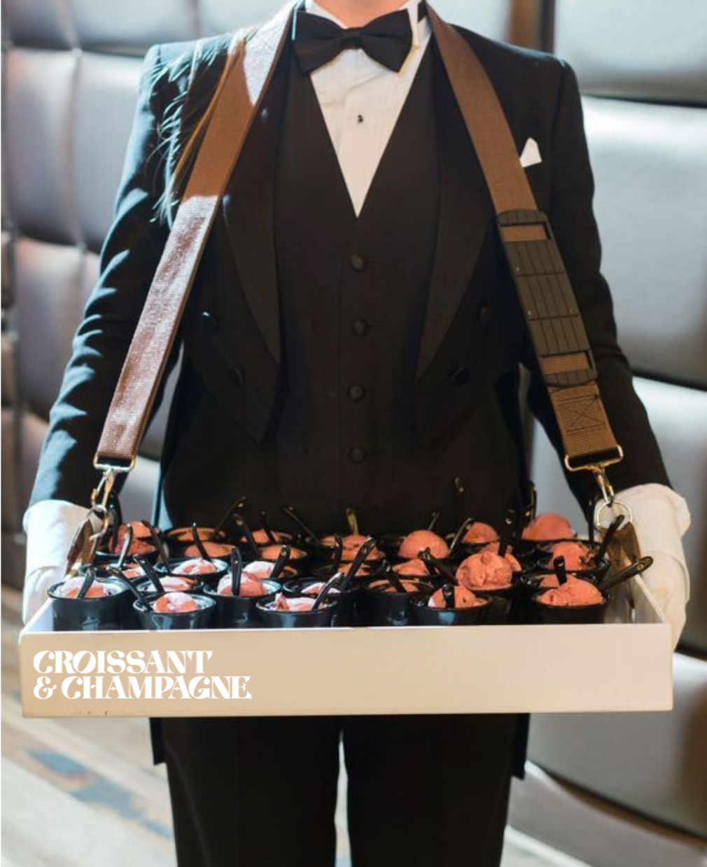
the reception staged like a theatre set, with backdrops and curtains heightening its theatricality; the rooms, warm and enveloping, conceived as an iconic backstage, with references to the art nouveau that once characterised Porta Venezia's public restrooms at the turn of the century; the "Croissant & Champagne" terrace, where real and scenic greenery alternate with large curtains dividing the spaces dedicated to breakfast, quick lunches and aperitivo.